Visualising taste for
St Austell Wines
Patterns • Concepts
St Austell Wines has a new contemporary look which incorporates the heritage of the business through archive photos coupled with bold illustrative colours.
The brewery’s design team asked me to create a range of patterns that bring to life the variety and depth of their wine tasting notes.
The process
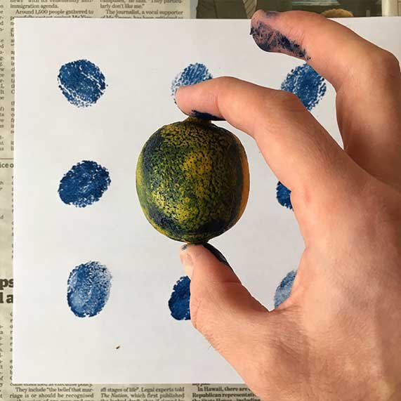
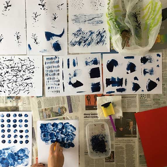
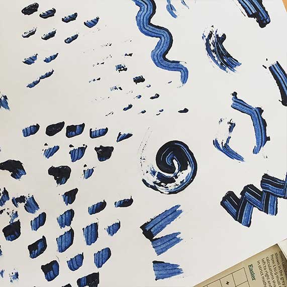
Abstract art can be very subjective so the challenge was to have an objective logic to the process. Patterns were reduced to basic elements and the result is toolkit of elements that can be used to create any number of patterns.
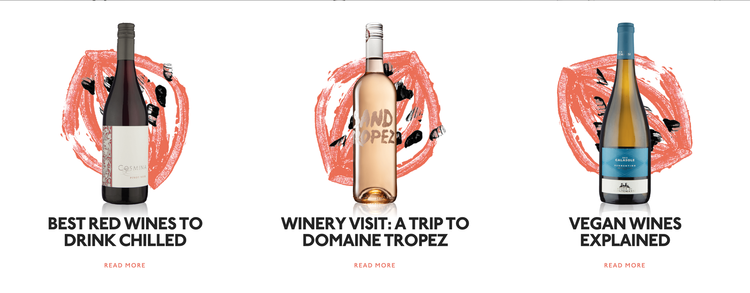
In application
The brewery’s in-house design team have the ability to edit, resize, or recolour patterns to fit each application. In the brochure cover for the 2017 wine list, the team at St Austell Wines were able to use a striking orange foil blocking which gave extra energy to the design – zesty!
“
We would have struggled without your help. It is fantastic and will very much enhance what we are trying to do with our wine business.”
Ian Blunt, Sales and Distribution Director
All designs © St Austell Wines.